Mittwoch, 4. Januar 2012
Schönes Html/CSS-Experiment von James Mellers, um die Voraussetzungen für responsive Webdesign zu visualisieren:
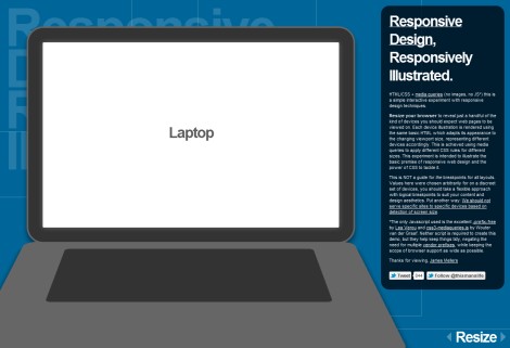
HTML/CSS + media queries (no images, no JS*) this is a simple interactive experiment with responsive design techniques.
Resize your browser to reveal just a handful of the kind of devices you should expect web pages to be viewed on. Each device illustration is rendered using the same basic HTML which adapts its appearance to the changing viewport size, representing different devices accordingly. This is achieved using media queries to apply different CSS rules for different sizes. This experiment is intended to illustrate the basic premise of responsive web design and the power of CSS to tackle it.
 Von mir
um 19:50h in
Von mir
um 19:50h in 
blog comments powered by Disqus
 RSS-Feed
 Twitter
 Flickr - Photo Stream
 Tumblr - Photo Blog
 Xing
Xing LinkedIn
 Facebook
 Behance
 Last.fm
 Instagram: psyckodad